Ever wondered how your favourite brands talk to you? What they sound like, and what they say to get a response? If you are building a brand of your own, those are not idle questions. Every brand has its own way of communicating: what it says is its brand copy, and the tone it says it in is its brand voice.
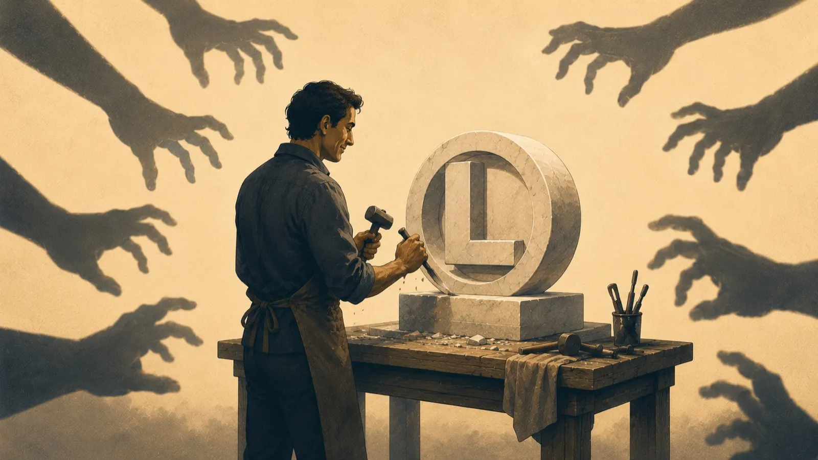
Brand copy sits alongside the logo and the colour palette as a core piece of a brand’s identity, but it is easy to treat it as separate from the visual design. In reality each is only at its best interwoven with the other. Great design can be undone by poor copy, and brilliant copy can be ignored entirely when the design around it is subpar.
What brand copy is, and is not
Brand copy is the text that communicates the tone and personality of the brand to its audience, something like the written form of your logo. It is not the same thing as several terms it gets confused with:
- Brand messaging is how you communicate your value: why studying with your tutoring service gets better grades, why your product beats the competitor’s. The messaging is what sets you apart; brand copy is how it is said.
- Marketing and advertising copy usually follows the brand copy and carries a call to action. Think of a Coke advert: it rarely speaks to you directly, it tells a story with the drink at the centre.
- Direct response copy speaks straight at the customer and asks them to act now, the mattress advert with the deal and the “come on down”. It can only be as forceful as your brand allows, which is exactly why the brand copy has to be defined first.
- Content is long-form value, a blog post or a guide, which builds a positive perception without directly selling anything. This article is content. The line on our homepage is copy.
Knowing which tool you are reaching for, and when, makes every one of them more effective. Brand copy sits at the centre, directing the others on how to sound like you.
Words and pictures, together
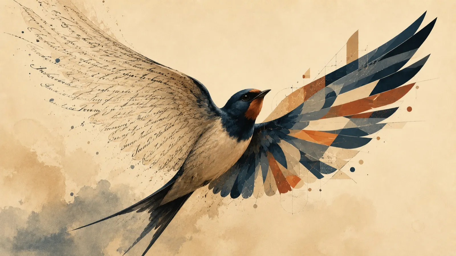
Copy explains and translates design; design illustrates and brings copy to life. Think of a storybook with and without pictures: the words work alone, but the story becomes far more engaging illustrated. Brand copy and brand design tell your story the same way.
Consider two lines that say the same thing:
- “These looks are the hottest, no matter if it’s day or night”
- “Fun and versatile styles that you’ll love”
Same concept, wildly different personality. A brand that uses the first would not use the second, and neither would pair happily with the wrong visuals. You would not set a cowboy logo in a futuristic font. When copy and design share one personality, the whole brand feels inevitable; the best small brands manage that consistency across every page, product and post.
Where it goes wrong
When copy and design fall out of sync, it is almost always a communication failure, and it usually shows up in one of three ways:
- The text does not fit. Too much copy for the design, spilling out of its container, instantly unprofessional. The cure is not a clever font, it is a designer and copywriter who talk to each other early and often.
- The voice and the visuals disconnect. The founder has one personality in mind, the copywriter another, the designer a third. A high-energy, busy banner over copy about relaxing holidays is what that looks like in the wild.
- The goals drift apart. Left without a firm brief, professionals fill the gap with their own assumptions. Clear, definitive direction removes the room for misinterpretation.
Keeping them in harmony
- Work in the same room, literally or virtually. Regular check-ins and a rule that key decisions get run past the other side catch drift before it becomes rework.
- Match skill sets to the job. You would not hire a web designer to draw a logo; do not hire a blogger to write brand copy. And treat the two roles as equals, they work synergistically, not in sequence.
- Design with the copy in mind, write with the design in mind. The more each knows about the other’s plans, the more the tone survives the journey from words to page.
One personality, everywhere
The holistic view is the whole game: not one image or one strapline, but a single look and feel carried through everything the brand touches. That is what a proper identity gives you, and it is exactly what our brand identity service builds: the logo, the palette, the voice, and the rules that hold them together.