Even if you have never heard the term, you have met a hundred hero images. The hero is the large, dominant image that greets you when a website loads, a cross between a banner and a welcome mat. Some sites keep one for years, others rotate them in sliders, but the job never changes: it is the first impression, and it often decides whether a visitor stays or leaves. The average visitor gives a website less than fifteen seconds; the hero image is most of what they see in that time.
What makes a good hero image
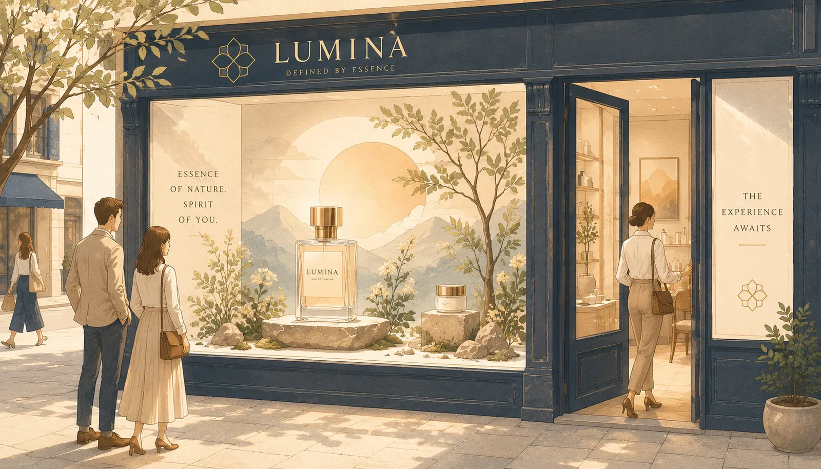
A successful hero shows rather than tells. Where a logo represents the brand as a symbol, the hero image is a token of the experience a visitor can expect. However unique the image itself, the good ones share the same deliberate design choices:
- an image that complements the headline
- an image consistent with the site’s brand and purpose
- a clear call to action
- genuinely high image quality
Start from your brand identity. The shapes, colours and type you have already chosen exist for reasons; interrogate those reasons and the right direction for the hero usually presents itself. A hero that reflects your brand’s personality builds trust from the first frame. One that does not is making promises the rest of the site cannot keep.
The headline and the call to action
The hero never works alone. It shares the stage with a headline that names what you do, and a call to action that points to the next step, because greeting a visitor is only useful if you then set them on a journey.
Balance and hierarchy carry all of it. Imagery and text need generous, orderly spacing, with no stark gaps and no clutter, and the elements must arrive in the right order: brand, headline, action. When the hierarchy is muddled, visitors meet the CTA before they know what you do, or miss the headline entirely, and a confused first impression is usually the last one.
Let the image tell a story
The strongest heroes and supporting imagery give a digital experience a real feel. Online shoppers expect half a dozen images per product, and what those images must do depends on what you sell: furniture photographed in a furnished room to give a sense of scale, clothing on people in settings that hint at a life, ingredients and mechanisms celebrated artistically where they are the selling point. For invisible products and services, illustration and iconography can evoke the experience instead, a how-it-works section in pictures for visual learners.
And do not underestimate what your customers contribute. User-generated photos and reviews look messier than curated brand imagery, but people trust other people more than they trust a press kit, which is why that content tends to close the sale at the bottom of the page.
Size, responsiveness and every screen
More than half of web traffic is mobile, so the hero must be responsive by design. Test how the image behaves across screens: whether vital areas crop away, whether text remains readable, whether the message survives on a phone held upright. A hero that only works on a widescreen monitor is a first impression most visitors never see. There is more on this discipline in our mobile-first design guide.
Test it like it matters, because it does
A/B testing settles hero decisions with evidence: half your visitors see version A, half version B, and the analytics name the winner. A weak hero shows up as shorter visits, fewer clicks and fewer conversions, so it is worth the experiment.
The hero image is the beacon of your website, tailored to your brand’s aesthetic and lit for every visitor who arrives. If yours is not earning its fifteen seconds, our web design team designs heroes, and the sites behind them, that do.