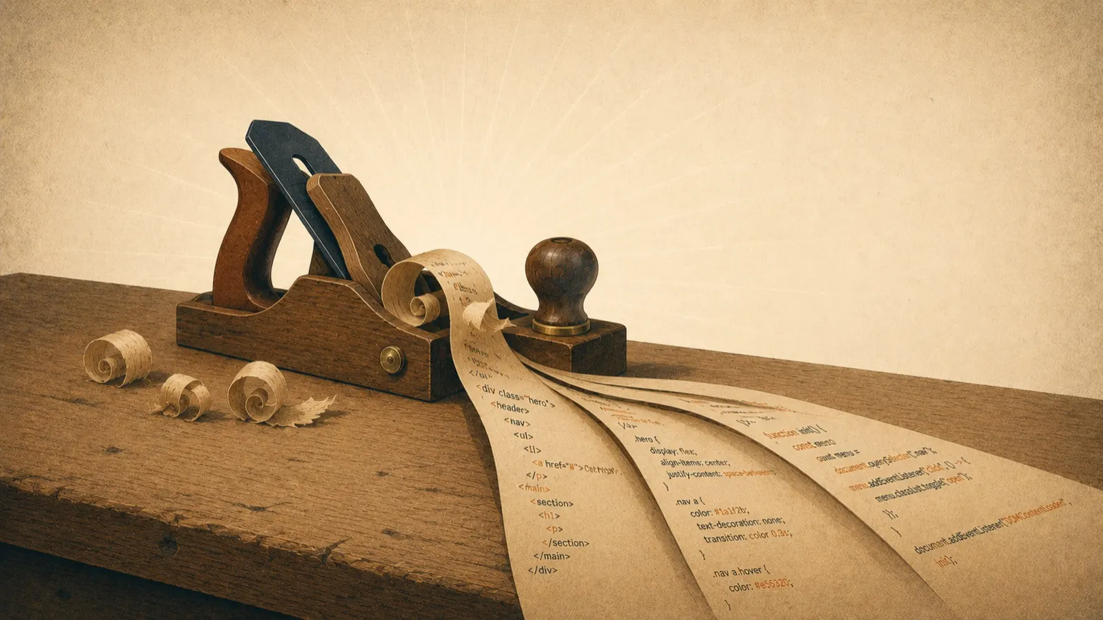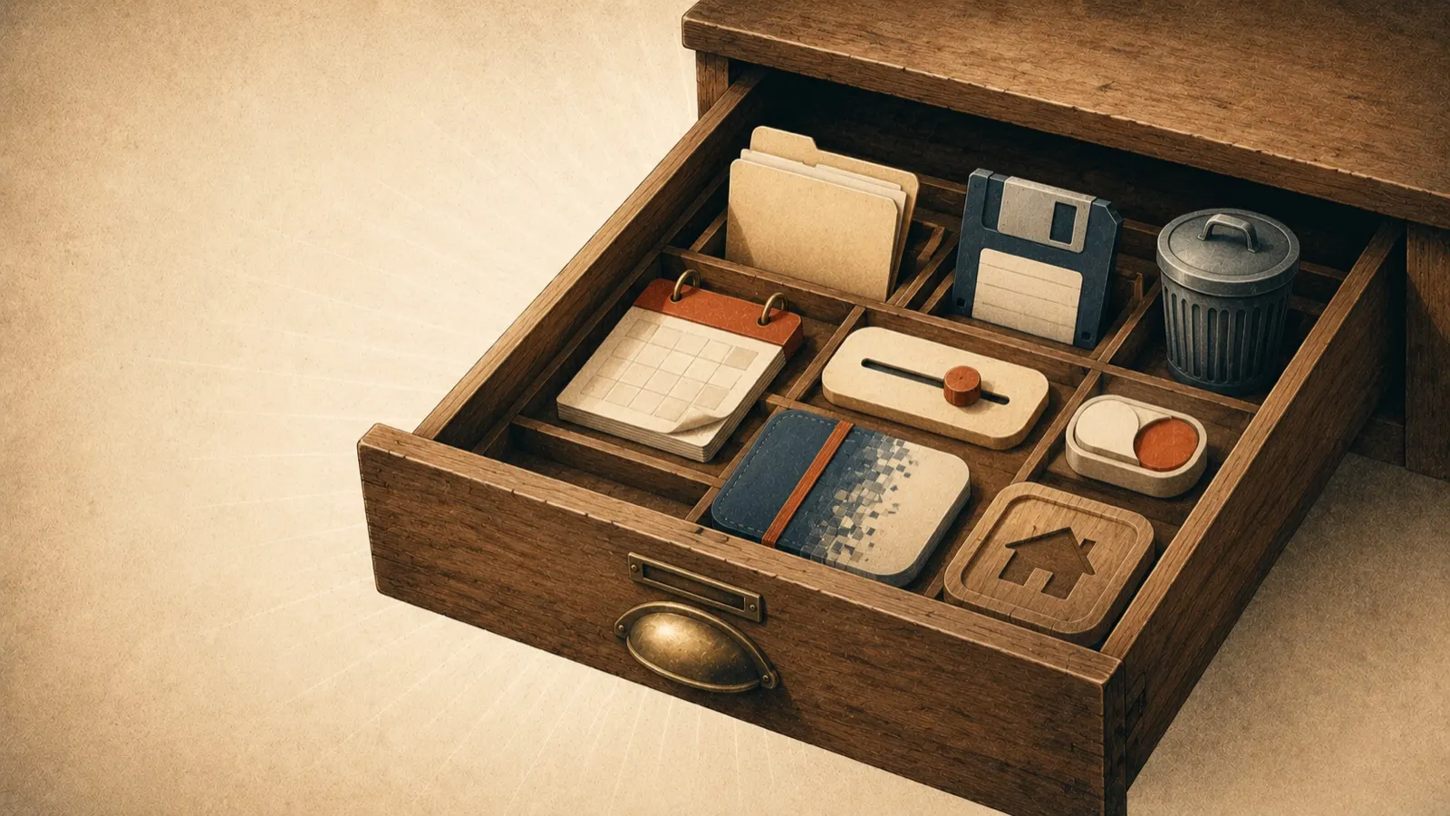
However handsome a website is, if visitors do not use it, it is about as useful as an ice shop in Alaska. Engagement is the largest determining factor in whether a design succeeds, because interaction correlates directly with the thing you actually want: people consuming your content, and eventually buying. Here are six proven ways to make a website something people interact with rather than merely look at.
1. Turn loading time into a brand moment
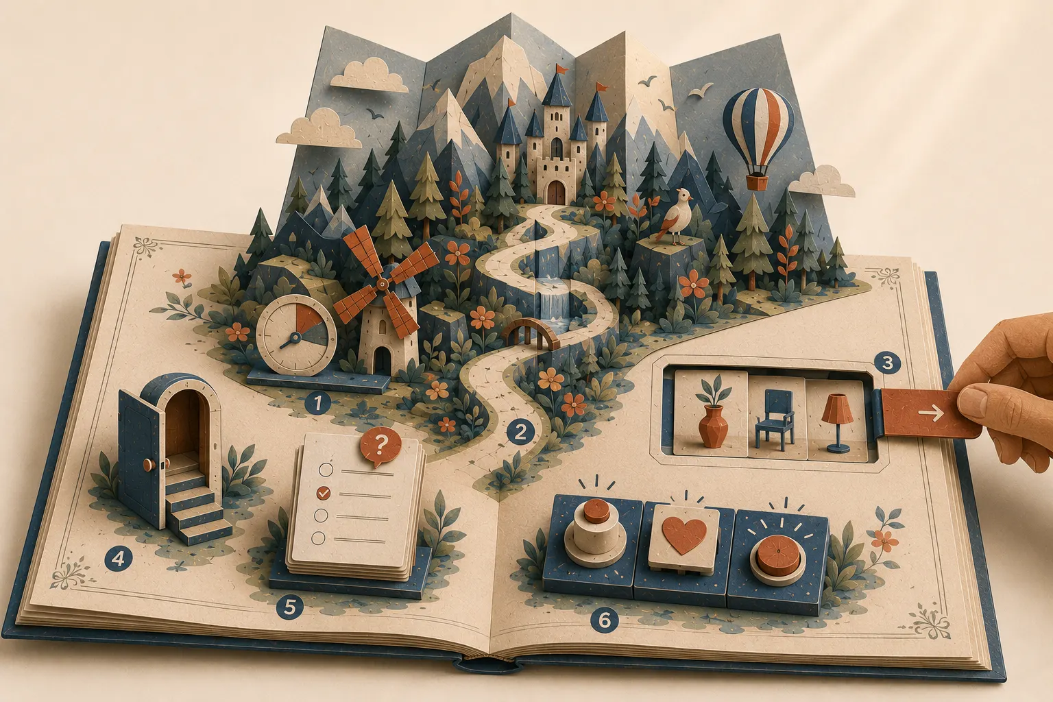
Loading screens have always been the designer’s headache: a few extra seconds before anything appears and visitors leave without a single interaction. But where a delay is unavoidable, it can be turned into a small experience. An animated progress bar with character, or a playful moment of brand personality, puts visitors in a positive frame of mind before the page has even arrived. Because so few sites bother, doing it well is memorable. The first rule is still to be fast; the second is to be charming about the moments you cannot be.
2. Organise information with animated scrolling
Scrolling is the most intuitive interaction on the web, and most designs waste it. Three techniques give it life:
- Scroll-triggered animations reveal elements as the visitor reaches them, creating the illusion that the page is being drawn in real time as they explore. Used sparingly, it makes long pages feel guided rather than endless.
- Scrolling page transitions move in deliberate jumps, closer to a slideshow than a stream, which suits storytelling layouts where each section deserves the full stage.
- Parallax scrolling moves foreground and background at different speeds, lending the page a sense of depth.
Whichever you choose, the purpose is the same: keep the visitor involved in the journey down the page, because an involved visitor keeps going.
3. Break up the vertical with sliders and carousels
A slider condenses related content into one area the visitor pages through at their own speed. Switching the movement from vertical to horizontal does something subtle and valuable: it removes the sense of forced progression a long page creates, and hands control back to the reader. For product ranges, portfolios and testimonials, a well-built carousel makes dense information digestible without shortening it.
4. Give navigation room to breathe
A pattern that arrived from mobile apps and settled on the desktop: navigation that stays out of the way until it is wanted, then opens generously. Keeping the menu tucked away gives the page its full stage, and when the visitor does reach for it, a large, clearly laid out menu puts every destination in view at once. The visitor gets everything at a glance, and can put it all away just as easily.
5. Replace forms with questionnaires
Nobody enjoys filling out a form; entire browser features exist just to spare people from doing it. Replacing a wall of input fields with a step-by-step questionnaire changes the experience completely: one personable question at a time, nothing overwhelming, and a finished flow that feels closer to a conversation than paperwork. Companies that live or die by form completion, tax preparers for instance, adopted this early and present themselves as mini consultants for it. If your business depends on enquiries, this single change can noticeably lift them.
6. Sweat the micro-interactions
The big animations get the attention, but the small ones sell the experience. Micro-interactions are the tiny responses a page gives: a button that turns green when pressed, an icon that becomes a tick, the subtle acknowledgement of a pull-to-refresh. Individually insignificant, together they tell the visitor that their actions change this little world, and that produces a quiet satisfaction that keeps people clicking.
Why it matters
When someone lands on your website, they need a reason to stay that the thousand alternatives do not offer. People love to interact with the world around them; a design that responds is a design that gets remembered. These six ideas are the foundation, and pairing them with the discipline in our web design tips will put your site ahead of most of the field. And if you would rather have it built properly from the start, that is what we do.