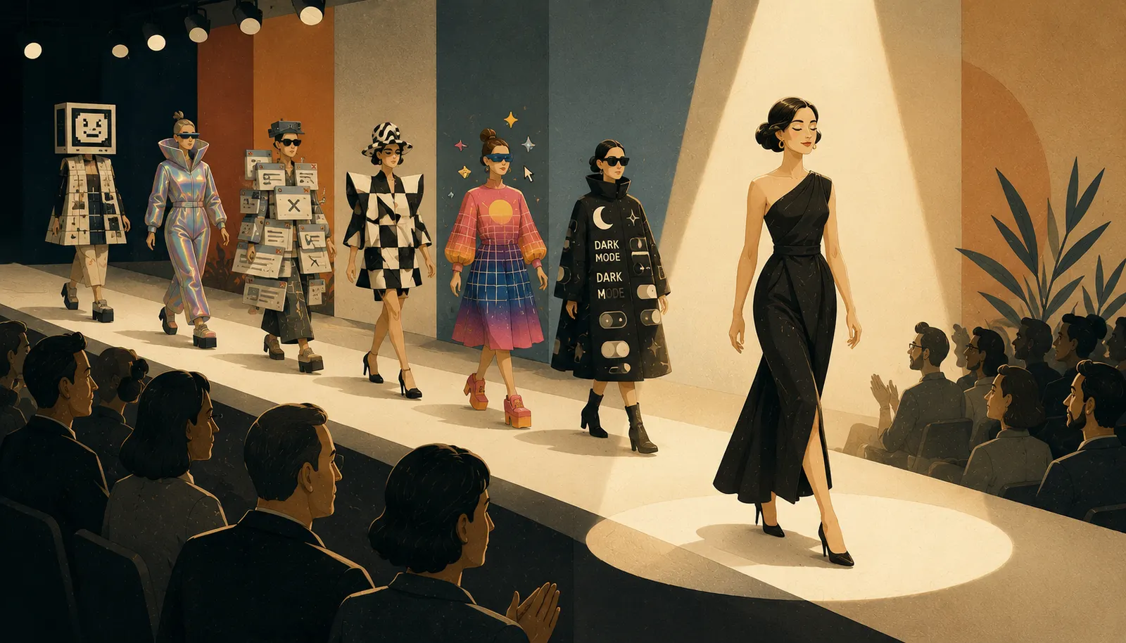
Design trends come and go, but the good ones leave something behind. We have been tracking web design trends for years, and looking back at what we predicted is a useful exercise: the trends that lasted all share one quality, they made websites easier or more pleasant for people to use. Here is what stuck, and why.
Dark mode earned its place
What began as an option in apps like YouTube, WhatsApp and Chrome became a fixture of operating systems and websites alike. The appeal is practical: less glare for people who spend all day at screens, longer battery life, and a stronger canvas for vibrant colour and bold typography.
Dark themes set a moodier, more dramatic tone, which suits edgier and luxury brands especially well, and they lean on generous negative space to keep the boldness deliberate. The caveat still applies: dark backgrounds punish copy-heavy, data-dense interfaces. Used judiciously, dark mode remains one of the easiest ways to make a design stand out.
Calmer, easier colour
Alongside dark mode came a broader shift: colour schemes designed to be easy on the eye. Designers moved beyond the stark choice of light or dark towards softer middle-ground palettes, pastels and natural tones that calm rather than dazzle.
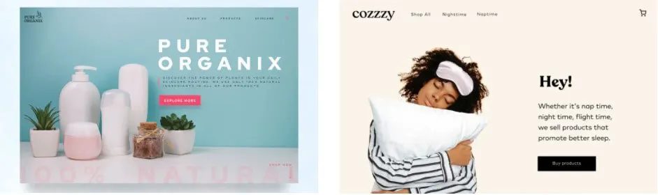
This was really accessibility wearing a fashionable coat, and it is the deeper trend that endured: designing with more concern for the person’s comfort than for dramatic effect.
Texture came back, carefully
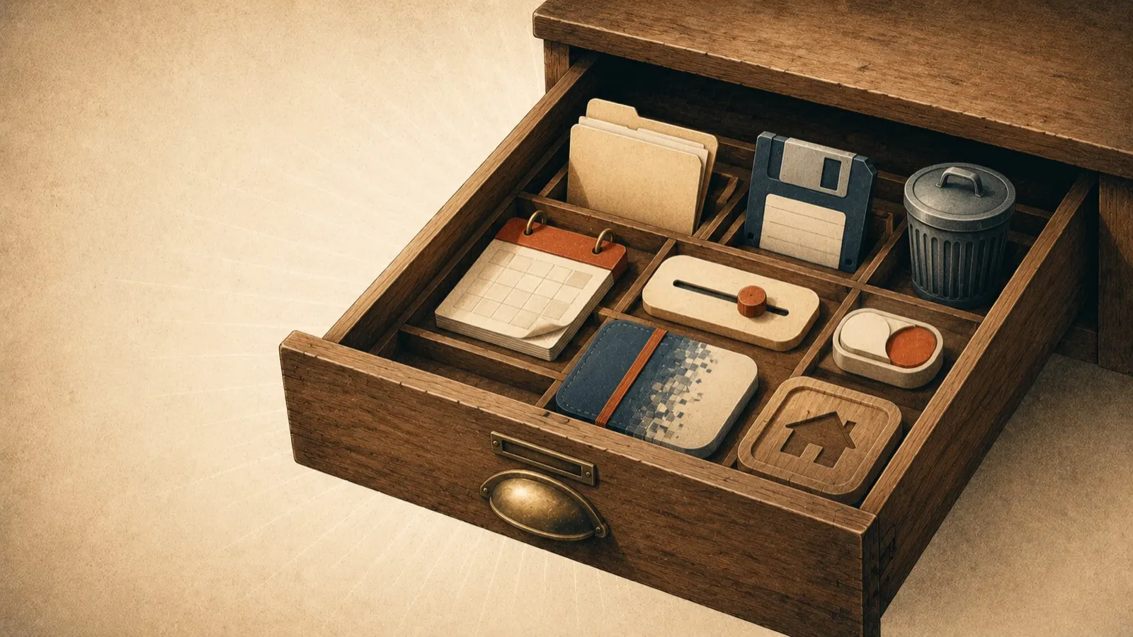
Neumorphism, the soft embossed look that evolved out of skeuomorphism, challenged the long reign of flat design with selective shadows and semi-flat colour that give interfaces a tactile, slightly raised feel. Its cousin, richer 3D colour, brought gradients and fine shading back to icons and UI elements.
Pure neumorphism proved divisive, but the underlying idea, that a little realism helps people feel what is clickable, has been absorbed into mainstream design. We wrote more about that lineage in skeuomorphism in web design.
Scrolling became an experience
Parallax effects grew up: multiple layers moving at different speeds, backgrounds shifting colour, layouts transforming as the visitor moves down the page. Done well, scroll-driven design turns the simple act of getting from top to bottom into a sense of involvement, and involved visitors stay engaged.
The lesson that lasted is about engagement, not spectacle. Every scroll effect should serve the journey towards the thing the visitor came to do; the moment it becomes disorienting, it is working against the page.
Abstract art over stock photos
Simple geometric shapes fused into energetic, sprawling compositions steadily replaced generic stock photography, especially once animated. The trend endured because it solved a real problem: stock photos make every business look like every other business. Bespoke illustration gives a brand a visual voice of its own, which is exactly why we draw ours by hand.
Brands showing their values
Design also became more openly purposeful: inclusive photography reflecting real customers, and brands aligning visibly with causes they believe in. Done sincerely, it plugs a brand into what its customers actually care about. Done cynically, people see through it quickly. The design lesson is the same as ever: authenticity reads.
Onboarding people actually enjoy
Interactive questionnaires and card-based sign-up flows replaced dreary form fields at the most critical moment of the user journey, the point where a visitor decides whether to hand over their details. Making that moment engaging rather than bureaucratic pays for itself, and personalised onboarding has only grown since.
What trends are actually for
A trend is worth adopting when it serves your visitors, and worth skipping when it merely decorates. That judgement is most of the job. If your website is due a refresh and you want it to feel current without chasing fashion, our web design team will happily tell you which trends are worth your money, and which are not.