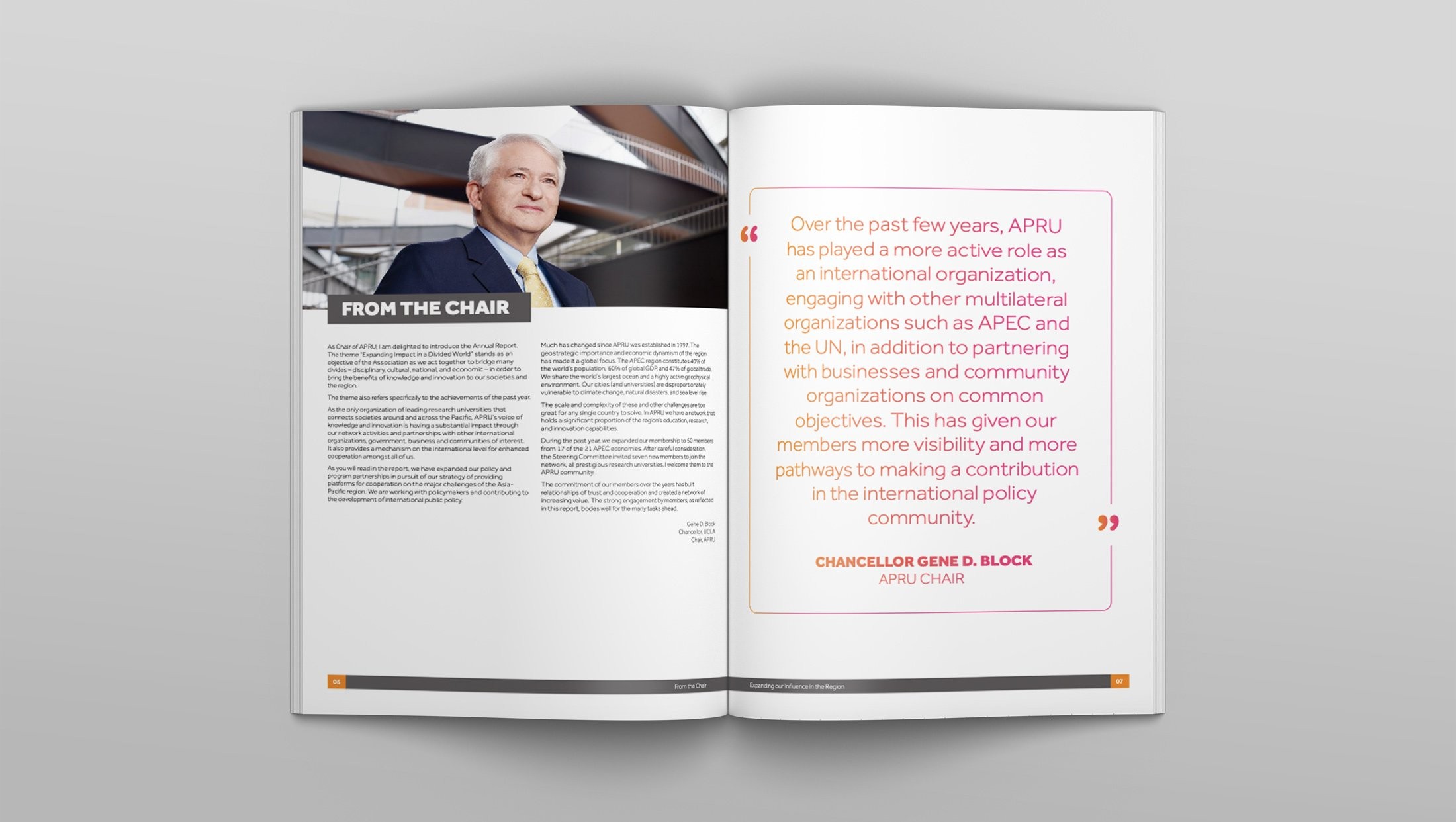
APRU are the Association of Pacific Rim Universities. They bring together thought leaders, researchers and policy-makers to exchange ideas and collaborate on effective solutions to the challenges of the 21st century.
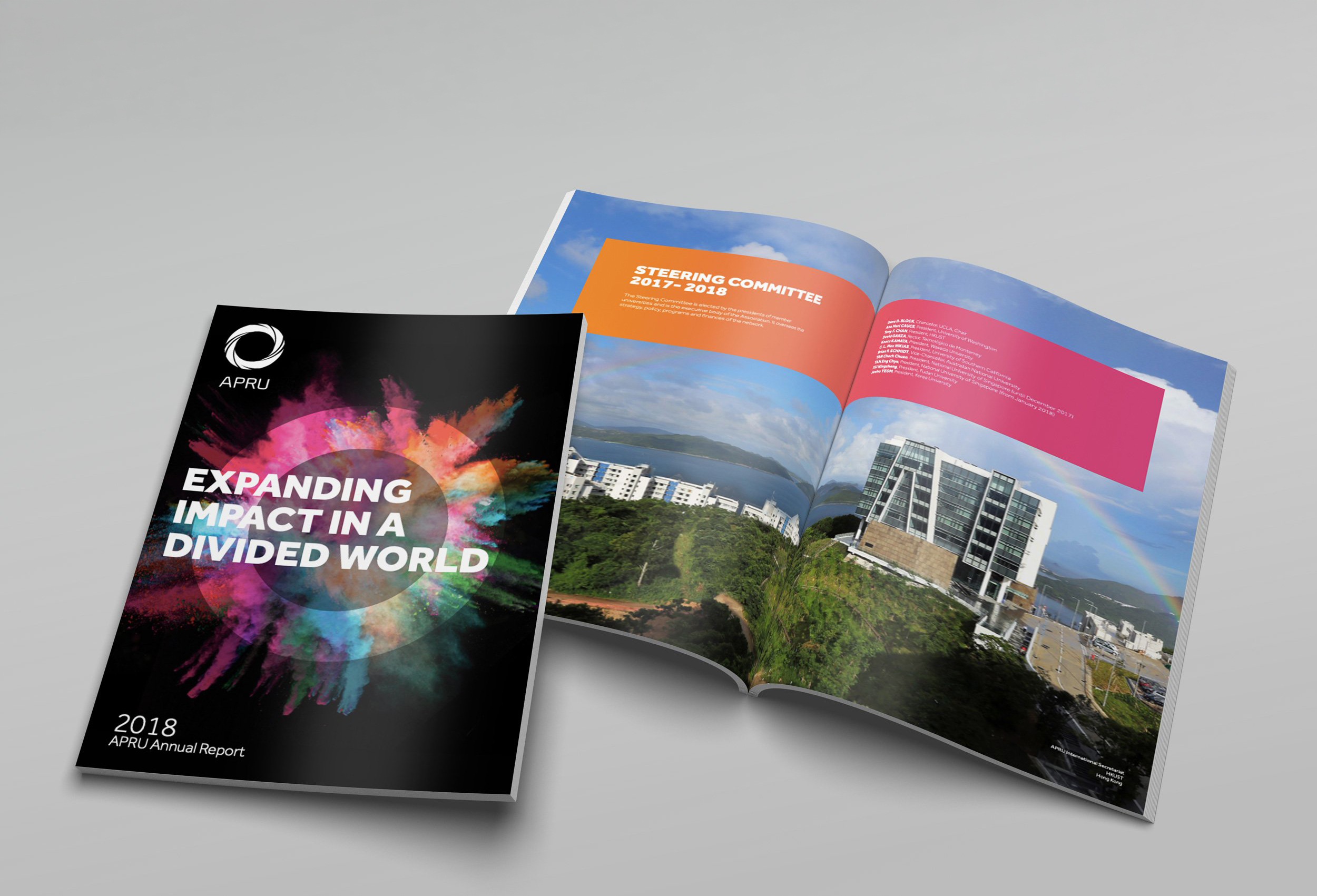
The theme of the annual report, “Expanding Impact in a Divided World”, stands as an objective of the Association. They act together to bridge many divides, disciplinary, cultural, national and economic, in order to bring the benefits of knowledge and innovation to those societies and regions. The theme also refers specifically to the achievements of the past year.
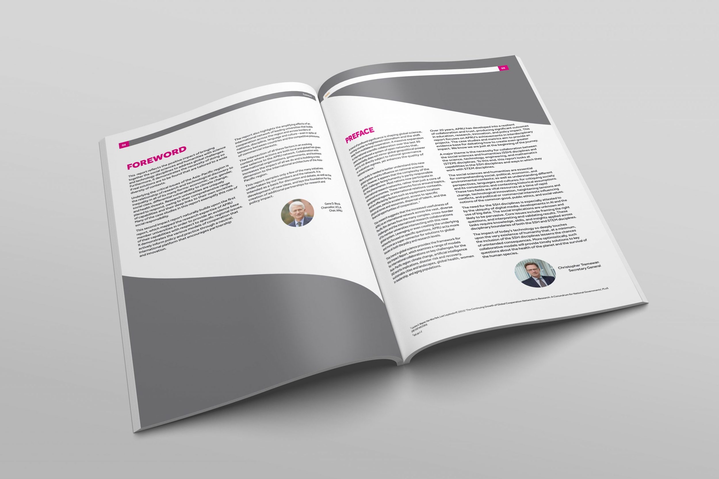
An annual report can be an overwhelming, unwieldy amount of information for the reader to plough through. That is why it is important to break the information down into attractively presented sections and snippets. Doing so gives the report more of a magazine feel and makes it seem less like working through an encyclopaedia.
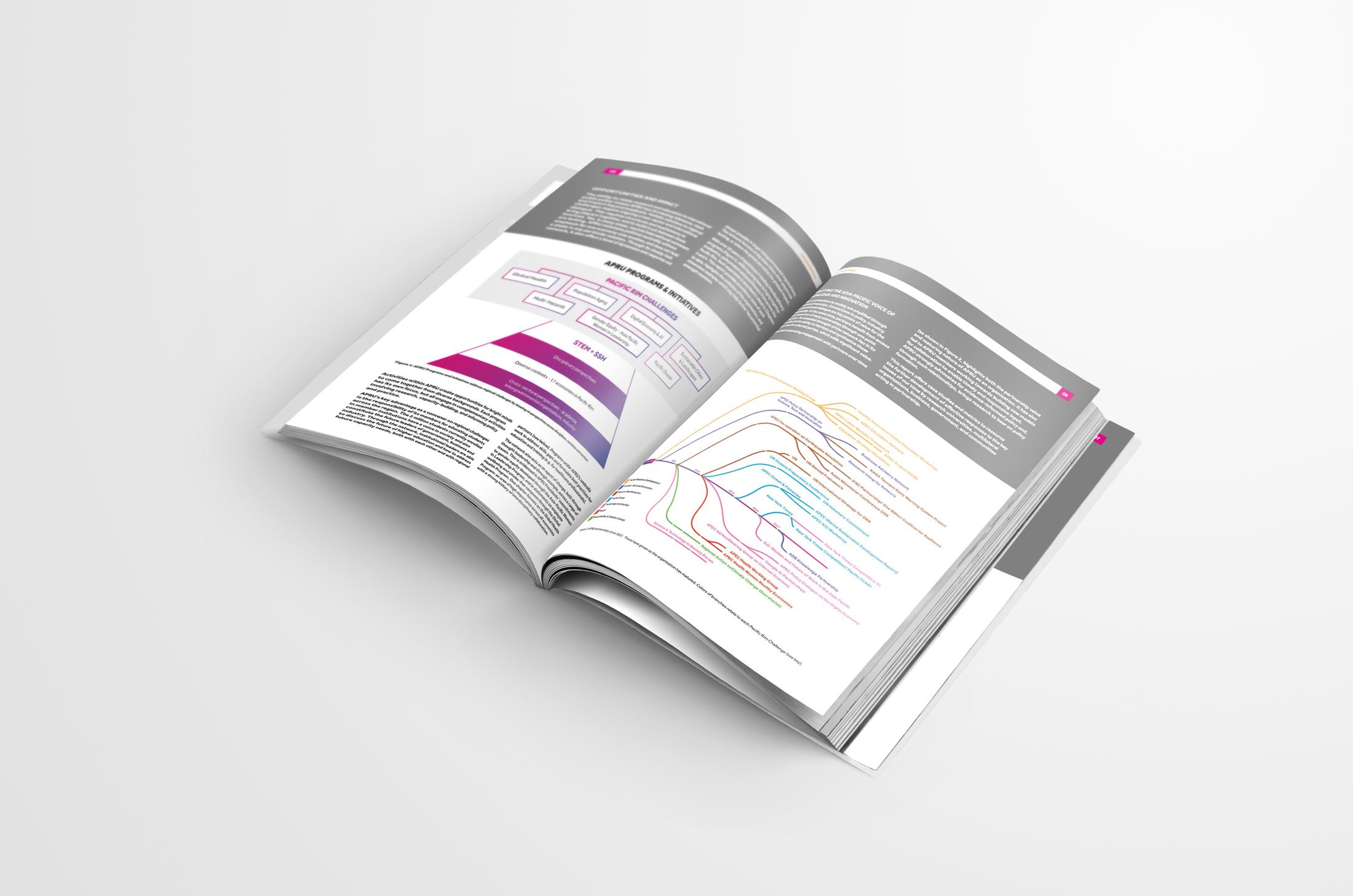
The APRU brand guidelines provided an array of colour options to choose from. These were used to mark out the different sections of the report with unique colour themes, a useful navigation device when the document runs to 81 pages.