Most pages on a website inform. The product page persuades. It is the one page dedicated exclusively to the sale of a specific product or service, and its ideal outcome is unambiguous: the visitor clicks Add to Cart. That clarity of purpose is what makes designing one a genuine challenge, because a beautiful design does not always equal a high conversion rate, and the real objective is getting the product off the screen and into the customer’s hands.
The anatomy of a product page
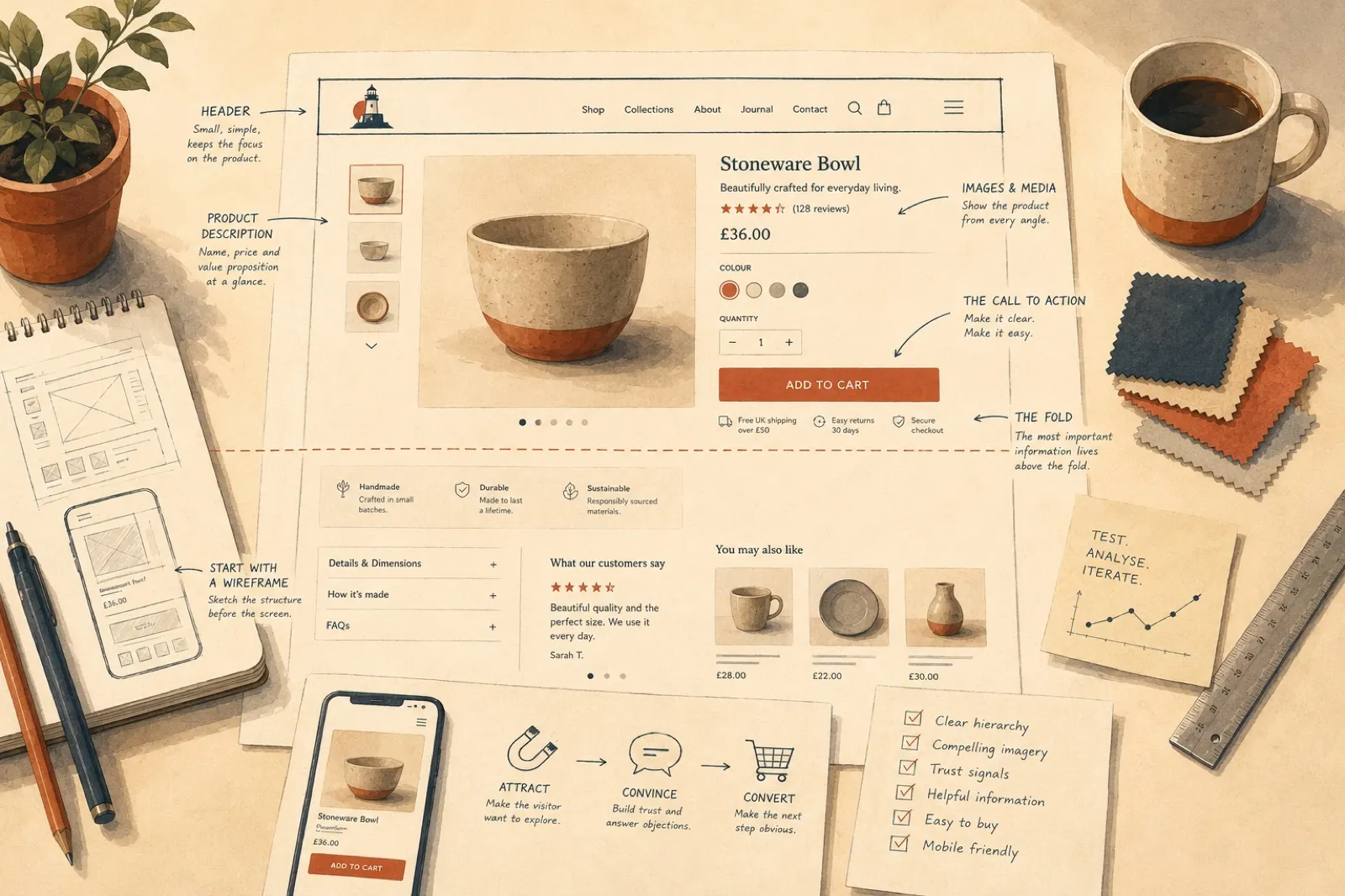
Product page content is structured around the fold, the point where the screen cuts off and the visitor must actively choose to scroll. The most important information lives above it:
- Header. Logo and navigation, kept deliberately small, often a minimised menu even on desktop. This page is about the product, not the chrome.
- Product description. Name, price, a concise value proposition, and often a review snapshot such as a star rating. It identifies the product and makes the pitch in a breath.
- Images and media. The primary product images, usually in a carousel showing angles, colours and variants. For a physical product, this is the closest thing to holding it.
- The call to action. The button that leads to purchase, with size and quantity options beside it. Nothing on the page should compete with it.
Below the fold, the supporting cast: detailed how-it-works information, dimensions and FAQs; peer endorsement in the form of reviews, testimonials and notable customers; supporting graphics that keep the scroll alive; and recommended products, so a visitor who decides against this item keeps browsing instead of leaving.
What goes where varies with what you sell. Physical and digital products, and visible versus invisible services, weight these sections differently, a software subscription leans on demonstration and FAQs where a ceramic bowl leans on photography.
Design practices that earn their keep
Start with a wireframe, then prototype. The process starts with pen and paper: a skeletal sketch of the page structure before any software opens. From there, prototyping tools like Figma produce accurate mock-ups and interactive prototypes that make testing fast. Purpose-built prototyping keeps the focus on user experience early; bespoke creative flourishes can come later, once the bones are right.
Use templates deliberately. A shop with hundreds of products cannot hand-design every page, so a template layout, applied consistently, is the professional approach. It demands planning: copywriters and marketers committing to a consistent set of images, feature lists and reviews for every product. Templates need not be rigid, palettes can shift with the product, but the structure repeats.
Respect the familiar layout. Images left, description and call to action right, benefits and specifications below, then FAQs and reviews: product pages share this shape across the web for a reason. Visitors intuitively know where everything is, and familiarity removes friction at the exact moment you want none. Distinctiveness comes from scale, colour and photography within the layout, not from moving the furniture.
Design with the whole site in mind. The product page is part of a journey, not an island. Its branding, tone and rhythm should be continuous with the pages around it, and its trust signals, reviews and endorsements above all, should be genuine and visible. Authenticity outsells polish.
Then test, analyse and iterate. Watch the analytics: bounce rate, cart abandonment, sessions that never reach checkout. Each pattern points at a different culprit, the design, the copy, the surprise shipping cost, and A/B testing settles arguments with evidence. We cover the testing discipline in more depth in our web design tips.
Part style, part science, all business
A great product page lifts the product out of the screen and into the customer’s daily reality. It is one part of the bigger craft of ecommerce web design, and when you are ready for product pages that close, our ecommerce design service builds them, template discipline, testing and all.