

No page on a website exists in isolation, and the product page least of all. It has to feel of a piece with everything around it, because consistency is not just a branding nicety: an incongruous product page reads, subconsciously, as less trustworthy to a prospective buyer, at the exact moment trust matters most.
Working within existing branding can genuinely constrain designers, if the brand team chose black-and-white imagery across the site, a product page that suddenly emphasises item colours will feel off-brand. The clean way out of these pitfalls: an ecommerce business that lives by online sales should start the whole website design from the product page, and let the rest of the site grow around it.
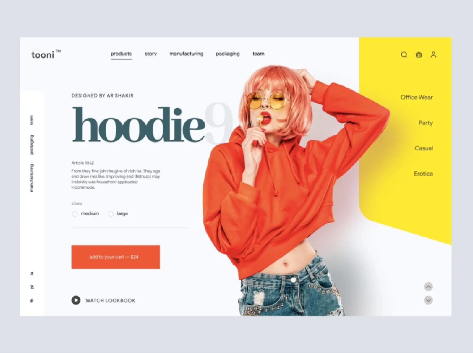
There is still room for creative liberties where brand personality should shine, a bold product image that carries the brand’s attitude, for instance. And it is never too late to consider a wider redesign if the product page cannot succeed inside the current one.
The checkout deserves the same whole-site thinking. It is usually a pared-down version of the product page, a miniature of the key image, price, quantity, options to make changes, and since shoppers abandon carts nearly 70 per cent of the time, checkout is exactly the place to restate the benefits: low fees, fast shipping. Overlaying the checkout on the product page also makes it easy to click back rather than leave the site entirely.
Prioritise information selectively
The product page balancing act is informing buyers without overwhelming them, deciding what the user sees, and when. Part of that is placement relative to the fold; part is the established visual-hierarchy toolkit of colour, type style and size.
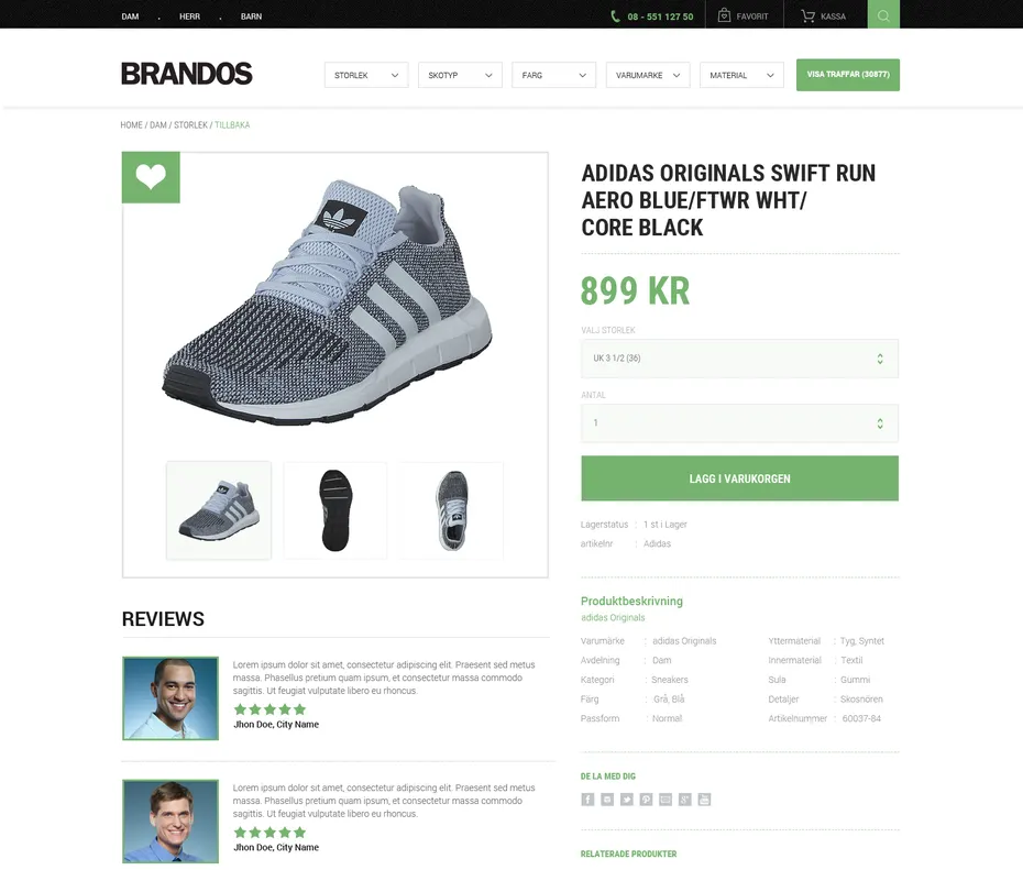
What gets priority also depends on what you sell. For aesthetic products, furniture, artwork, apparel, the product image is the main selling point; for products and services without a visual element, the description takes over.
The call to action is always high priority, but that does not mean an oversized button in neon. Contrast against the surrounding elements is the technique that works. And attention-tracking tools such as Crazy Egg will tell you, scientifically, which parts of the page are actually being looked at, invaluable when visitors’ attention is landing somewhere you do not want it.
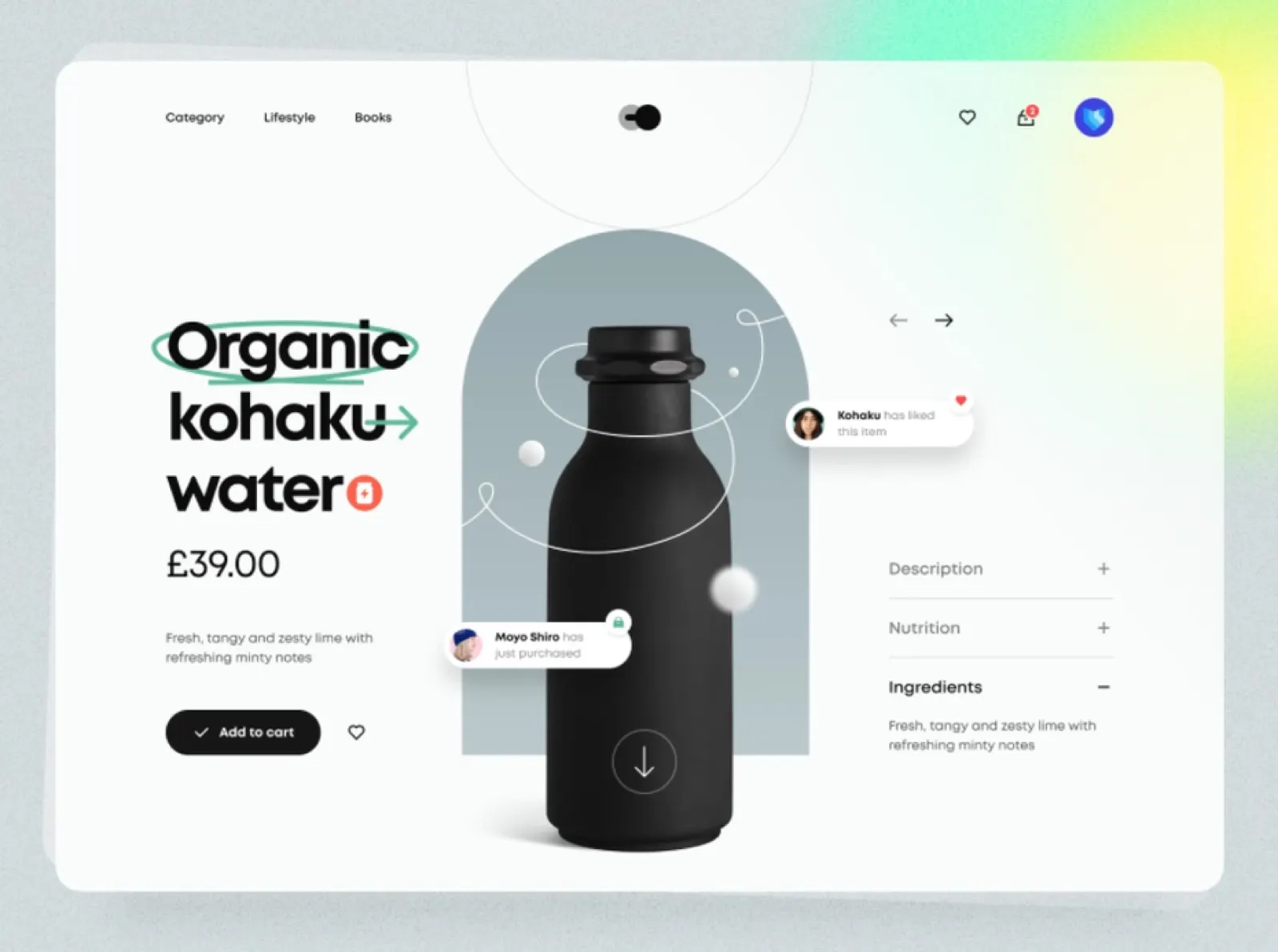
Finally, condense the secondary content. Collapsible FAQ sections and swipeable carousels for reviews and images keep the page uncluttered while encouraging interaction, visitors stay actively engaged instead of reading passively. Both techniques, and the rest of the product-page craft, are covered in our product page design guide.