


Most of your visitors will meet your website on a phone. What mobile-first design actually means, how it differs from mobile-friendly and responsive, and the principles that make it work.
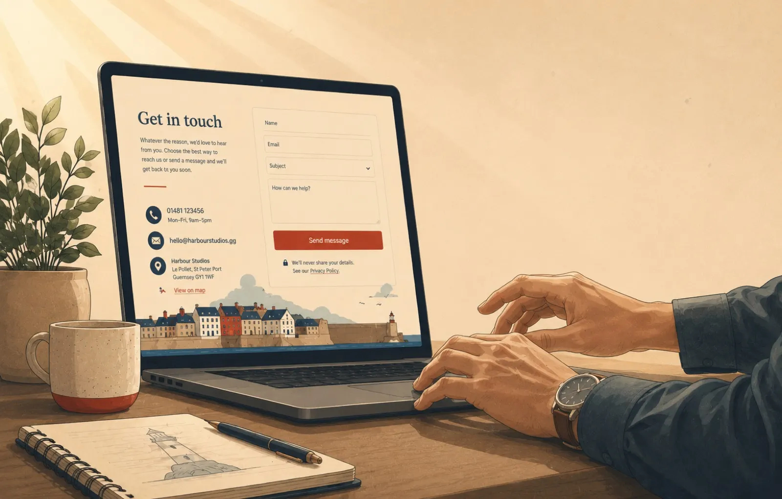
The contact page is where interest becomes an enquiry, and most businesses treat it as an afterthought. Seven tips for a contact page that works as hard as the rest of your site.

The imagery you choose for a hero must fit the website and the brand, and it does not have to be static. When abstract works, why quality is non-negotiable, and how to animate without slowing the page.

The hero image is your website's welcome mat: the first thing every visitor sees. What makes a good one, how to pair it with a headline and CTA, and how to keep it working on every screen.

From loading screens that earn a smile to micro-interactions that make a page feel alive: six proven ways to make a website something people use, not just look at.
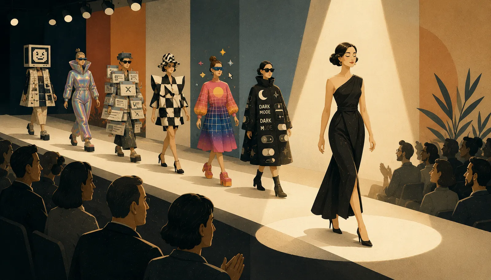
Dark mode, neumorphism, scroll effects, calmer palettes. A look back at the design trends we tracked, which ones earned a permanent place, and what that says about designing for people.